 |
 |
 |
Deep Simplicity: Tezuka Architects
at Gallery MA
Thomas
Daniell |
 |
 |
 |
 |
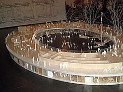
| Model
of the Fuji Kindergarten in the main interior space |
 |
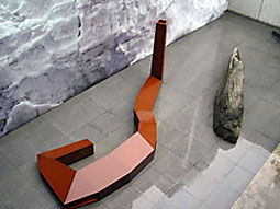
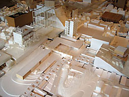
Model of the Matsunoyama Natural Science Museum in the courtyard |
 |
Takaharu and Yui Tezuka are a color-coded
married couple. Her possessions are all red, his are all
blue, and the things they share -- their Citroen 2CV,
for example -- are all yellow. This combination of directness,
simplicity, and humor also infuses their architecture.
Avoiding needless experimentation with form for its own
sake, their buildings are conceived as devices to enhance
life's simple pleasures: sunlight, breezes, views, family
interactions.
Without an understanding of the way they are inhabited,
these projects can seem relatively mundane (the media
has been surprisingly sympathetic -- their well-known
Roof House was the first building in the history of Japanese
architecture magazine Shinkenchiku to include the
clients in the photos), but given the conceptually and
formally overloaded work that dominates the architectural
world around them, it shows a degree of courage to attempt
so little, so quietly. The Tezuka Architects exhibition
at Gallery MA has a similar courage. Cheerful and casual,
with none of the indulgent sophistication of most architecture
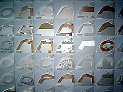
exhibitions, it comprises little more than an enormous
pile of study models, two enormous presentation models
(a bare wood model of the Fuji Kindergarten in the main
interior space, and a rusting steel model of the Matsunoyama
Natural Science Museum in the exterior courtyard), and
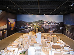
several enormous photos of finished buildings. The architecture
is presented raw, without the ubiquitous explanatory diagrams
or obscure philosophical references that are so often
used to make the ordinary look difficult. There is no
contrivance, no deception, no preciousness, just an unembarrassed
candor about processes and results.
Which is not to say that these buildings are ordinary.
Although they use more or less conventional construction
methods, in each project some aspect is always pushed
to its limits, exaggerated into an overarching theme --
and yet this is always based on function, only incidentally
on shape. Sensitive to time, climate, and season, the
recurrent use of broad roof decks, huge windows, sliding
panels and operable walls are all an outcome of proposed
living patterns, not a desire to be spectacular. The Tezukas
even take pleasure in the fact that key aspects of their
projects are difficult to capture in photographs. The
over-scaled spaces and long spans may require unusual
structural solutions (structural engineer Masahiro Ikeda
is often credited as co-designer), yet the structural
details are never used to generate the aesthetic -- perhaps
in reaction to the high-tech expressionism of Takaharu
Tezuka's former employer, Richard Rogers.
The exhibition is laden with clusters of working models,
sequences showing constant reiteration with minor variations.
No one of them is worthy of inclusion on its own, yet
cumulatively they are an extraordinary display of rigor
and invention. The Tezuka design process clearly prioritizes
rough hand-drawn sketches and handmade models -- self-imposed
constraints that ensure an unaffected honesty in the buildings
themselves. Of course, there is a risk that the disarming
messiness of the design process and the straightforward
ingenuity of the architecture can become a stylistic affectation
in itself. Yet so far, the Tezukas seem capable of making
all the right moves, with nothing going to waste.
|
 |
 |
 |
 |
| Enormous photos of finished buildings |
 |
Rough hand-drawn sketches and handmade models |
 |
 |
 |
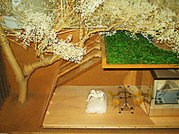 |
| An unembarrassed candor about processes and results |
 |
Architecture to enhance life's simple pleasures
All photos taken by Thomas Daniell |
 |
|