 |
 |
 |
The Next Generation
Thomas
Daniell |
 |
 |
|
 |
|
The
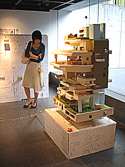
first-prize winning project by Yuichi Nakada focused
on a huge, rough model.
|
|
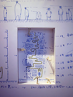
Sketches
made directly on the partition walls, with small notches
for plastic people.
|
 |
This year saw the fourth time that the Sendai
Design League (a group of local architects and educators)
has collected together the best final-year design projects
by architecture students from across Japan. They are put
on display at the Sendai Mediatheque, where a jury of
professionals selects the top three by deliberating live
in front of an audience. It's an extraordinary scene,
inexplicably able to draw huge crowds -- mostly other
architecture students, of course, but also many members
of the general public and the mainstream press. This year
saw a record attendance of about 3,000 people.
The event is called the Sotsugyo-sekkei Nihon-ichi Ketteisen,
which the organizers translate as "Architectural
and Urban Design Graduation Championship Series."
A ketteisen is a tournament or playoff (the same word
is used for tennis or sumo), suggesting that this is a
real-time sport, complete with cheering, tears, groupies,
tension, and genuine surprises.
The organizing committee consisted of architect Hitoshi Abe, critic and historian Taro Igarashi, architectural planner Yasuaki Onoda, architect Masayoshi Takeuchi of Mikan, Osamu Tsukihashi from the Tohoku Institute of Technology, and Tohru Horiguchi and Masashige Motoe from Tohoku University. Each year, a different guest is invited to lead the jury; past chief jurors include Toyo Ito (architect of the Sendai Mediatheque) and Osamu Ishiyama (an architect and Waseda University professor), but this time it was Terunobu Fujimori (an architectural historian who over the last decade has reinvented himself as an amateur architect).
Universities from
around the country contributed projects that were culled
down to a pool of 374 entrants. After a day of extended,
often humorous, public debates the jury settled on a first,
second, and third place, along with two honorable mentions.
The results, together with highlights of the tournament
itself, were then turned into an exhibition at Gallery
MA (somewhat awkwardly entitled "The Best of Graduation
Works 2006 in Nippon"). The lower gallery space contained
the five selected projects, with models and panels arranged
by the designers themselves, interposed with comments
from the jury and photos of the scene at the Mediatheque.
On the upper level, almost every project entered was available
for view. They were placed in bins of identically sized
plastic portfolios that allowed them to be flipped through
easily. The gallery space looked like a secondhand record
store with furniture made of blue expanded polystyrene.
Against the back wall was a large video projection of
the tournament itself.
The first-prize winning project by Yuichi Nakada focused
on a huge, rough model crowded with miniature plastic
people that also spilled out across the floor, suggesting
he was less interested in the built form than in what
the people do around it. Rather than placing presentation
drawings on the partition walls provided, he sketched
directly on them, and notched out small spaces for more
of the same figurines to inhabit. Second-prize winner
Kota Segawa used simple modular geometries in clusters
that recall the experiments of the 1960s Metabolists,
yet also swarming with the same plastic figurines. Third-prize
winner Maki Onishi translated a diagram of overlapping
curves into an irregular web of curvilinear buildings
and courtyards -- and more of the same little people.
The honorable mention design by Hiroyasu Miyoshi was also
a proposal for a system of overlapping linear buildings
and courtyards, but with a life-size installation that
demonstrated some of the materials and textures being
proposed. The other honorable mention design, by Yu Toida,
seemed to be less a building than an obscure statement
on phenomenology and perception.
There was a surprising lack of computer graphics among the winning projects, and a reassuring coarseness to the drawings and models. No doubt the selection process was heavily influenced by Fujimori, who has always favored the hand-drawn, hand-made, and self-built.
Given the current tendency in architecture toward complex
sculptural shapes assembled with implausible precision,
whether or not the five graduates honored here go on to
become major figures in the Japanese architecture world
is less important than the statement being made by their
selection.
|
 |
|