| The creation of 21_21 DESIGN SIGHT, a new gallery in Tokyo's Akasaka district, began with a 2003 newspaper article written by fashion designer Issey Miyake. Titled "Let us build a design museum," Miyake's proposal for a new type of exhibition venue was quickly taken up by developers Mitsui Fudosan and Kitayama & Company. Together with the Issey Miyake Foundation, they incorporated the gallery into a development on a large site in downtown Tokyo. 21_21 DESIGN SIGHT was finally inaugurated on March 30 this year as part of Tokyo Midtown, a vast commercial, residential, and cultural complex. Only a few minutes walk from both Gluckman Mayner's Mori Art Museum and Kisho Kurokawa's recently opened National Art Center, 21_21 DESIGN SIGHT completes the so-called "Roppongi Art Triangle."
The curatorial team consists of Miyake, graphic designer Taku Satoh, and industrial designer Naoto Fukasawa, assisted by design journalist Noriko Kawakami. The building itself was designed by Tadao Ando. It comprises a pair of partly buried reinforced-concrete volumes with roofs of folded steel sheet that Ando intends as a reference to Miyake's A-POC ("a piece of cloth") clothing line, in which complex shapes are made by cutting and folding a single surface.
The gallery has no permanent collection, but will showcase the work of designers considered to be looking into the future (the name of the gallery is a play on the phrase "20/20 vision"). The opening show is Construction Site 2006 "A Hard-Fought Process", focusing on the design and construction of the gallery itself, along with six other as-yet unbuilt Tadao Ando designs for Tokyo -- all public facilities such as train stations and libraries. Included in a separate room is Ando's contribution to the cultural district currently in planning for the Abu Dhabi waterfront.
 |
 |
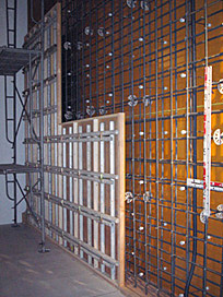
| Mockup of standard concrete construction |
 |
The exhibition consists almost entirely of rough sketches and study models, arrayed on long, narrow tables covered with photos showing construction and aerial views of the sites. The models themselves are covered with sketches and notes in Ando's distinctive hand, and are interspersed with full-size chunks of the building -- samples of concrete, timber formwork, steel reinforcing rods. In a sense, the gallery spaces not being used for the exhibition are themselves exhibits, with the entire building as the culmination of the show. One wall of the main space is lined with a mockup of Ando's standard concrete formwork system, showing the relationship of plywood panels, reinforcing steel, electrical and plumbing conduits, scaffolding, and the small conical plastic plugs that hold it all together -- the latter incidentally creating the grid of small dots on the exposed concrete surfaces that characterize Ando's architecture.
There's nothing unusual about Ando's concrete construction method, and he wasn't the first to use exposed concrete in this way (buildings such as Louis Kahn's Salk Institute are obvious precedents), but it is the absolute conviction and consistency of Ando's work that has turned a generic technique into a personal signature. Interestingly, it's the many surface imperfections that are crucial to the success of the concrete. As Tom Heneghan has noted elsewhere,* the famed smoothness of Ando's concrete is simply a misconception. It's not bad, but it's not perfect, either. Excessively smooth concrete would draw too much attention to itself. For Ando, the emphasis is clearly on defining spaces, channeling sunlight, framing views, choreographing the movement of people. Unadorned concrete is merely the most neutral and uniform construction material available for his purposes, and to be distracted by the quality of finish would miss the point.
Ando himself is a rough diamond, a former boxer without any formal architectural education, mischievously playing up his south Osaka mannerisms amid Tokyo's cultural elite (the contrast between the dialects of Tokyo and Osaka is analogous to London and Manchester, or Boston and Brooklyn). Refusing to polish things for public consumption is the key to the integrity of the architect as well as the architecture -- rough edges that signify pure intentions.
* Tom Heneghan, "Predicated on Participation" in Tadao Ando 1988-1993, Tokyo: A.D.A. EDITA, 1993, pp. 8-23. |