 |
|
Focus features two in-depth reviews each month of fine art, architecture and design exhibitions and events at art museums, galleries and alternative spaces around Japan. The contributors are non-Japanese art critics living in Japan.
|
|
|
 |
 |
 |
Asakusa Gets Postmodern: The Asakusa Culture Tourist Information Center
Michael Pronko |
 |
 |
|
 |
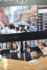
| The first-floor information desk is a pleasant, practical face for Japan's emerging tourist industry. |
|
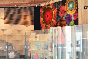
The interior combines textures, shapes and colors in dynamic but never overwhelming ways. |
Designing a functional, appealing eight-story building for tourists must not have been an easy task, but the Asakusa Culture Tourist Information Center combines old and new, functional and aesthetic, urban grit and anime-fantastic, information and relaxation in marvelous ways. Set on a small corner lot in Asakusa across from Kaminarimon gate, perhaps the most tourist-filled place in Tokyo, the new Information Center looks as if it was casually tossed there years ago, and yet projects ready-to-work vitality.
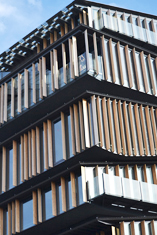
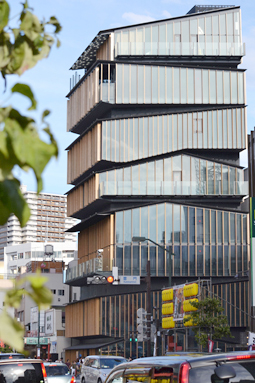
Designed by Kengo Kuma and Associates, the building could be a stack of giant, refurbished nagaya, the traditional wooden houses of the shitamachi "low city" district. The layering incorporates the Japanese aesthetics of wabi-sabi, the beauty coming not from pristine symmetry, but from being simple, natural and well worn. The rhythm of the exterior wood slats creates energy through the crooked horizontal lines, each of the eight floors "off" in its own unique way.
The interior of the building plays with other pleasing tensions. The first floor's high-tech information center, designed to provide tourists with practical, useful information, contrasts with the easy industrial feel of ceiling grates, exposed tension rods and other structural components. The space is both a living website to load up on ideas, directions and recommendations, and a calm retreat from the hectic pace of touring Tokyo.
 |
|
 |
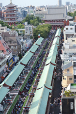
| The view to the past: a different view of Sensoji temple, offering a fresh new vantage point. |
|
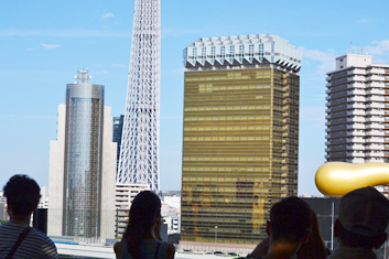
The view to the future: Tokyo SkyTree and Asahi Beer rising up from the Sumida River below. |
Fascinating details abound. Each area has beveled wood on the floor, ceiling or wall that brings in the liveliness from the building's exterior. The gray, white and flat black color scheme matches the alternately soft wood and bouncy rubber flooring. Even the bathroom tiles are done in traditional repeated patterns taken from Japanese kimono. The interior design never rests: the various structures slope, slice, wrap and layer, moving the eye in gentle ways without overtly controlling the gaze.
Each of the floors is designed for a distinctive purpose with a fitting layout. The upper stories have a WiFi area for individual info searches, racks of flyers and handouts, lecture rooms, and a terraced video room with a looped film about the history of the Asakusa area. Permanent displays on the neighborhoods of the shitamachi break up one floor with glass panels, and another floor has space for rotating exhibitions. Both spaces feel as chicly retro as anything in Shibuya.
Upstairs, though, is where the clever placement and situational planning of the building comes out most powerfully. The centerpiece of the building is the observation deck, from where one can assimilate the different parts of Asakusa. The viewing area looks down on Kaminarimon and Sensoji temple with its shopping street of souvenirs and knick-knacks. In the other direction, across the Sumida River, stands one of the first postmodern structures in the area: the Asahi Beer building, with its architectural rendering of a beer glass and a gold flame, and beyond, the brand new Tokyo SkyTree tower.
 |
|
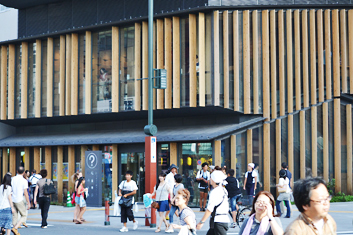 |
| The dynamic asymmetry of the exterior, with each floor distinct. |
|
Made for people, from street level to the eighth-floor viewing deck. |
Unlike most architectural creations in Tokyo, the Information Center functions more as a connecting nexus than its own singular creation. It doesn't compete or stand out, but instead harmonizes and integrates. The building triangulates the view of the most important temple of the shitamachi in one direction and in the other, the new technology represented by SkyTree, the historical importance of the Sumida River, and the commercial power of a big business.
The eight-story view, a rare one in Tokyo where observation points tend to be at the extremes of either street-level or skyscraper, allows one to concretely visualize the urban metaphor of Tokyo's special blend of religion, commerce, information and pleasure. Tokyo could use more observation spots and more practical faces for Japan's growing tourism industry like this one. Without being overdone, the building showcases the best elements of Japanese aesthetics and design, both old and new, while being useful, captivating and thought-provoking.
 |
|
 |
| Precarious or stable? The feeling of motion and rhythm is both complex and easy to grasp. |
|
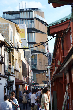
Already part of the landscape, the building blends humbly in with its surroundings. |
|
 |
 |
Michael Pronko
Michael Pronko teaches American literature, film, art and music at Meiji Gakuin University. He has appeared on NHK, Sekai Ichiban Uketai Jugyo, and other TV programs. His publications include several textbooks and three collections of essays about Tokyo. He writes regular columns for Newsweek Japan, ST Shukan, The Japan Times, and for his own websites, Jazz in Japan and Essays on English in Japan. |
|
 |
|