 |
 |
Focus features two in-depth reviews each month of fine art, architecture and design exhibitions and events at art museums, galleries and alternative spaces around Japan. The contributors are non-Japanese art critics living in Japan. |
|
|
 |
 |
 |
Design Ah! -- Design Delight for Kids, and Adults Too
Lucy Birmingham |
 |
 |
|
 |
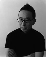
| Taku Satoh |
|
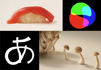
Design Ah! exhibition montage |
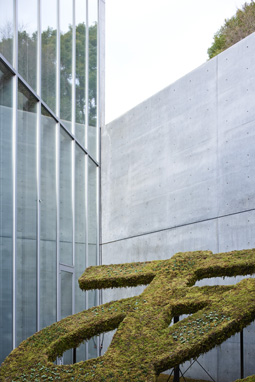
It was a sunny Saturday afternoon when I stepped into Roppongi's 21_21 Design Sight for a look at the ongoing Design Ah! exhibition. "Ah!" I thought, as I immediately spotted 14 baby trams lined up neatly near the entrance. Bathed in the sunlight pouring through the expansive ground-floor windows, they appeared to be part of the exhibition, but I quickly realized they were the visitors' mode of transport. "Ah!" I murmured as I strolled ahead, dodging toddlers and their parents, who were taking family photos by the large, sculptural exhibition logo  -- the hiragana character pronounced A. The character is short for the exclamation ara, translated as "Ah!" in the exhibition title. -- the hiragana character pronounced A. The character is short for the exclamation ara, translated as "Ah!" in the exhibition title.
Heading down the stairs to the subterranean level, I paused for another "Ah!" (plus a "Wow!") as my eyes swept across a sea of babies, preteens, and parents clustered about the 30-plus displays -- touching, drawing, mimicking, playing, laughing, and totally absorbed in the moment. It's the first time for the museum to host an exhibition geared toward kids since it opened in March 2007. Ah! indeed.
 |
|
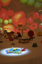 |
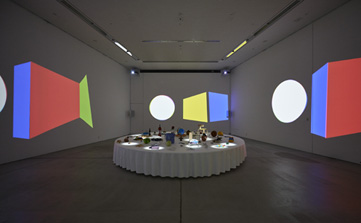
| Room of Objects, Sounds and Movies, by tha ltd. + Cornelius |
For exhibition director Taku Satoh, creating that "Ah!" moment for kids is part of his goal of nurturing their "design mind." Satoh says design is an integral part of our lives, and that the way we think about design is vital to our future. "Educating children about design before they've formed concrete ideas is extremely important, I feel. By the time one reaches university age it's too late." He adds, "I think it's a mistake to give a child childish things. Adults should give 'real' things to a child."
Satoh points out that the exhibition isn't just for kids. "I also want adults to come and play," he says. "If kids see adults playing and having fun, they'll want to do the same."
Children's education has been a mainstay of Satoh's work for over 10 years as planner, researcher, art director, and designer for the popular NHK television show Nihongo de Asobo (Let's Play with Japanese). The Design Ah! exhibition is essentially a 3D extension of Satoh's other NHK educational TV show by the same name that premiered in 2011. Inspired by the show's art direction and activities, the displays are a mix of interactive and "hands-off" -- a fascinating study in fun, deconstructive learning.
 |
|
 |
Gallery 2
|
|
Everyone's "Ah!" |
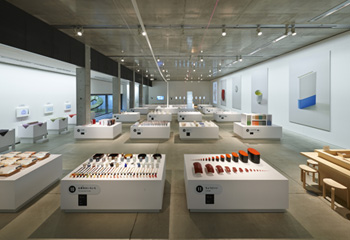
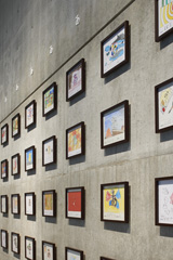
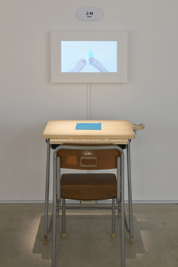
Displays in the central and largest section of the show are divided into five themes: sushi, books, containers, money, and school. At the start of each is a deconstructed version of the item that reveals its inner ingredients or workings. From there, visitors are drawn to the item in whole and in various forms.
One eye-grabber is "Sushi Breakup," with the answer to the mystery question: How many grains of rice are there in a piece of nigiri (hand-shaped) sushi? You can actually count the cooked grains lined up individually with bits of dried seaweed and raw fish slices, all molded into clear acrylic blocks. From there you move on to "The Many Faces of Sushi" with Japanese tableware and utensils. Next is "Just Right Sushi," showing hyper-real replicas of sushi topped with bright orange ikura (salmon roe) or red toro (tuna) in sizes from huge to tiny. At the end of this section is the "Sushi Building Block," built like a square sushi bar. Here kids can stand behind the counter like chefs and serve their customers (a.k.a. parents) the colored sushi-look-alike wooden blocks. (Business was hopping the day I was there.)
 |
|
 |
| Origami by Taku Satoh Design Office + Origata Design Institute |
|
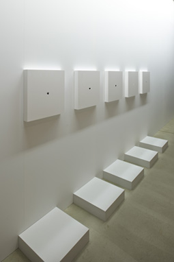
Ana (Hole) by Taku Satoh Design Office |
Another popular display is "Rub It with a Coin." This one actually begins at the museum entrance where visitors receive a piece of paper drawn and cut in the shape of a purse. Visitors can place the paper "purse" on small stacks of international coins and make a coin rubbing with colored pencils. It's the last stop in "Money Breakup," a section that teaches the shape, design, and comparative uses of money.
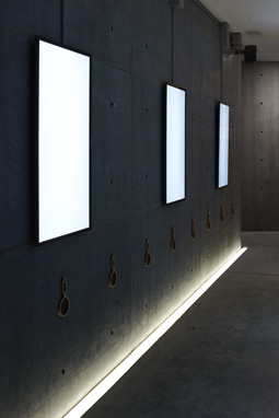
Some seemingly simple displays are actually hi-tech wonders created by design engineers. Award-winning interface designer and Design Ah! director Yugo Nakamura oversaw the technical wizardry. One such display is "Sound Monocle" by Hisato Ogata of takram design engineering. Blank white screens reveal moving shapes with a handheld viewing "monocle," highlighted by music.
Two remarkable hi-tech displays by tha ltd. delight and astound. "'Ah!' in Motion" uses projection and image capture. Lines from the hiragana  projected onto a wall follow and recreate the shapes of visitors within the capture field. When a camera icon appears, photos of participants are taken and quickly displayed on the wall. Toddlers to grandparents can enjoy swinging their arms, dancing, and jumping as the projected onto a wall follow and recreate the shapes of visitors within the capture field. When a camera icon appears, photos of participants are taken and quickly displayed on the wall. Toddlers to grandparents can enjoy swinging their arms, dancing, and jumping as the  -shaped lines follow their every move. -shaped lines follow their every move.
 |
|
 |
| Sound Monocle by Hisato Ogata (takram design engineering) |
|
"Ah!" Plaza by plaplax
All images courtesy of 21_21 Design Sight, 2012 and 2013 |
Working with the composer Cornelius (Keigo Oyamada), tha ltd. also created "Room of Objects, Sounds and Movies." In a large darkened room, visitors are surrounded by rhythmic musical sounds blended with a cornucopia of images projected onto the four walls. The playlist includes "Theme of 'Design Ah!'," "Design Counting Rhyme #1-#10," "Color Magic," and "Round and Square." On the day I visited this captivating display: a toddler sitting on his father's shoulders mesmerized by the sights reverberating around him, and the sound of children's laughter.
"I think the exhibition is brilliant because it's so common-sense in a way, and yet nobody does it," says Astrid Klein of the Tokyo-based Klein Dytham architecture and design firm. "Everybody tries to make things look more than they really are. Satoh always has a very analytical, clear and fun way of dissecting products, graphics, and other things so that it becomes easy to understand in a playful way. That's really great, not only for kids but obviously for adults too."
What is Satoh's formula for nurturing his own "design mind"? "I have the mind of a child," he says, laughing. "Through and through."
 |
 |
Lucy Birmingham
Lucy Birmingham is a long-time, Tokyo-based journalist, scriptwriter, author, and former photojournalist. She writes regularly for TIME magazine and her articles have appeared in many publications, including the Wall Street Journal, Newsweek, Bloomberg News, and Architectural Digest. As an arts and culture writer her articles have appeared in publications including Artinfo.com, Artforum.com, and ARTnews. She is also a scriptwriter and narrator for NHK (Japan's public broadcaster) and has published several books including Strong in the Rain: Surviving Japan's Earthquake, Tsunami, and Fukushima Nuclear Disaster.
lucybirmingham.com |
|
 |
|
|
 |
|
 |
|