|
Focus features two in-depth reviews each month of fine art, architecture, and design exhibitions at art museums, galleries, and alternative spaces around Japan. |
|
|
|
|
|
Beauty and Profundity: The Transformational Ink Paintings of Toko Shinoda
Jennifer Pastore |
|
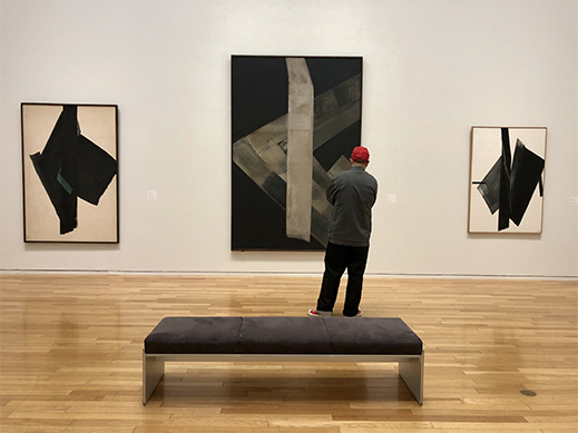
Toko Shinoda: A Retrospective installation view, left to right: For the Green (1965), Distant (c. 1964), and Play (2001) |
Maybe it was all a 107-year dream. That was the lifespan of Toko Shinoda (1913-2021), a widely celebrated Japanese artist who worked primarily in calligraphy and abstract ink painting. Her retrospective currently at the Tokyo Opera City Art Gallery spotlights the evolution of her expression over nearly seven decades with some 115 works and several other displays.
The sumi ink used in Japanese calligraphy is made with pine soot compressed into sticks ground on special stones. Water is added to create a dark liquid for painting. As a substance, sumi is difficult to control, requiring quick thinking and movements that leave marks which cannot be erased or redone. The washi paper the ink is typically painted on absorbs it readily. In a 2017 interview with a 104-year-old Shinoda, Tyler Rothmar compares the immediacy of ink painting to playing a musical instrument. As a whole, the art form is a kind of sublimation of the moment.
|
 |
|
|
|
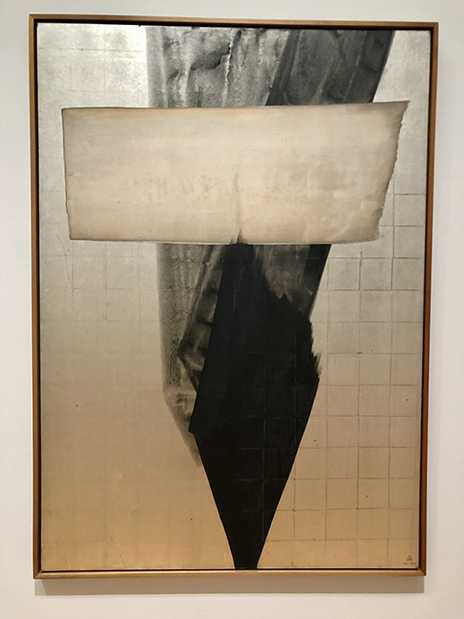
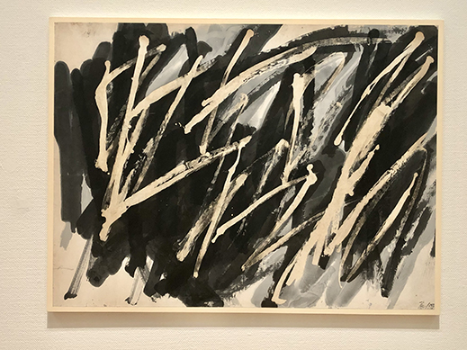
Fire/Fire II (1988)
|
Shinoda's father's family hailed from Mino, the old name for what is now Gifu Prefecture. This region in central Japan has long been known for producing washi, and the two written symbols that make up the name "Mino" translate to "beauty" and "profundity." Shinoda, who was also an accomplished essayist, once wrote that these characters evoked sumi for her "in all its dark and beautiful shades." Although she was raised and educated in Tokyo, Mino played a meaningful role in shaping her aesthetics. The process of making sumi on her inkstone reminded her of the "limpid" waters of the Nagara River in nearby Hida, where she spent a summer before the war. She was captivated by cormorant fishing, a millennium-old custom in which birds dive into the river for fishermen's catches. Describing the scene, she wrote: "Movement and stillness, light and shadow intermingle, interlaced by time and color, white and black as torchlight glimmers in the night on the waters at the foot of the mountains." [From Shinoda Toko 100 Years: Momo no Fu (Scenes from a Century), a book published for an exhibition on the occasion of her 100th birthday.] These motifs of darkness and light, movement and stillness appear repeatedly in Shinoda's work. Fire/Fire II (1988) could be interpreted as a black bird plunging headfirst. In coloring and composition, it also recalls Jakuchu Ito's 18th-century ink painting Crested Myna and the Moon.
 |
|
 |
|
|
|
|
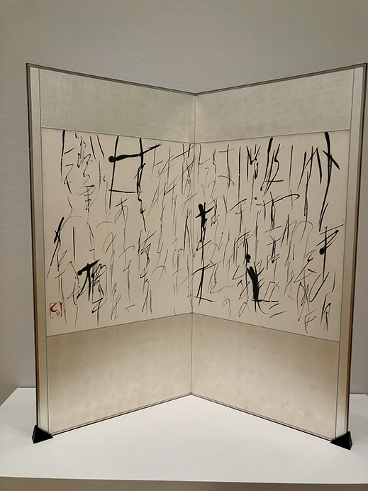
From "Hagitei," a Poem by Sakutaro Hagiwara (c. 1954)
|
|
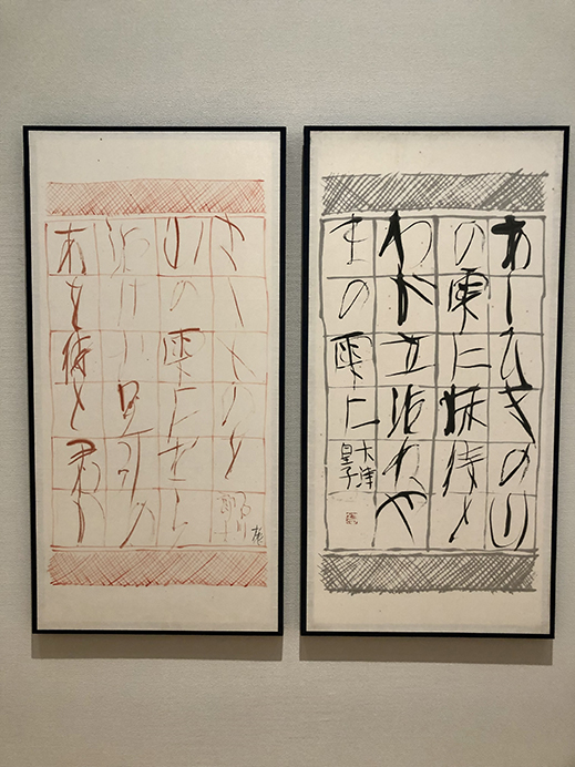
"A o Matsu to," Man'yoshu (vol. 2, no. 108: Ishikawa no Iratsume), left, and "Ashihiki no," Man'yoshu (vol. 2, no. 107: Prince Otsu), right (both before 1955) |
Named Masuko (満洲子) for Manchuria where she was born, Shinoda learned calligraphy from childhood. The rigorous, disciplined practice involves transcribing writing systems and classical texts in ink. To Shinoda, painting letters and poems was "an adventure in finding form" and "a scaffolding for consciousness" as she mastered the ability to construct space, time, and movement. If calligraphy is like music, this segment of Shinoda's career might be compared to playing classical scores. The training is prescribed and stringent, but the further one advances, the more important interpretive expression becomes. It is worth noting that even in her earlier works in this show, Shinoda demonstrates a bold style and a willingness to incorporate cinnabar in her work, adding a vermilion associated with instructional correction to what is typically a monochrome medium.
Shinoda's first solo exhibition, at Ginza Kyukyodo gallery in 1940, was panned by critics who did not appreciate her flaunting of conventions and wrote her pieces off as "foundationless." Undeterred, and believing ink painting had the potential for a wider range of creativity, she set out on the path of avant-garde contemporaries such as Shiryu Morita and Yuichi Inoue. "Forgetting the constraints of calligraphy, I created works that took the form of my spirit as it was," she wrote.
 |
|
|
 |
|
|
|
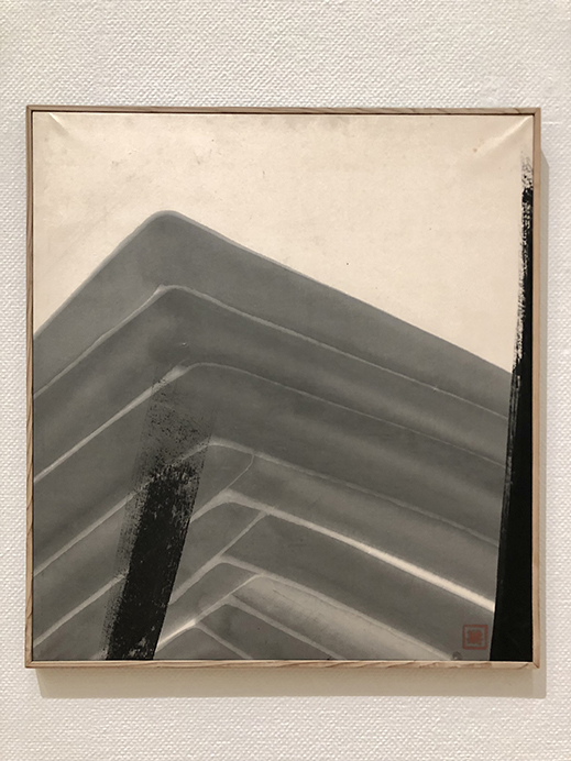
Boundless (1958)
|
Shinoda would find her recognition overseas. She was included in an exhibition of Japanese architecture and calligraphy at New York's Museum of Modern Art in 1953, then stayed in the United States from 1956 to 1958. She immersed herself in the burgeoning Abstract Expressionist movement, whose vitality and purity of expression she likened to ancient scripts. She reported being impressed with the freedom and inventiveness of the New York art scene, and her works were met with popular and critical acclaim. Success abroad -- where the words of her calligraphy were generally unreadable -- gave her greater confidence in producing more non-pictorial, freely inventive paintings. One might say she shifted from classical music to experimental jazz.
Despite the creative revelations she found outside the country, Shinoda ultimately decided to return to Japan after two years away. The climate was apparently a major factor; she commented that she realized Japan's humidity was essential to how washi soaks up ink, a condition that could not be replicated elsewhere. Still, her paintings after returning were clearly shaped by her time abroad, displaying even more lively and rhythmic strokes as well as seeping and blurring effects. They also began featuring, with greater frequency, gold and silver leaf and metallic paints and powders that lend them a brighter, glimmering sheen.
 |
|
 |
|
|
|
|
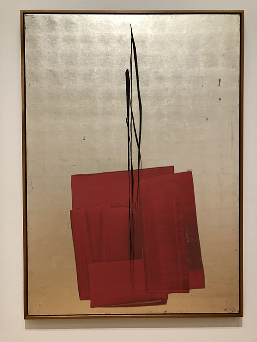
For Thee (II) (1988)
|
|
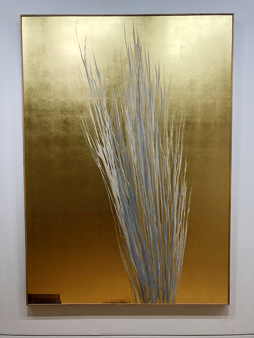
One Hundred (2012) |
Shinoda painted One Hundred (2012) in the lead-up to her centennial year. It is a dazzling, propulsive work on a gold-leaf background with a bundle of sharp white and gray strokes extending from the bottom upward.
Drawing a line for each of my years
One line for each year I have lived and all of those lines together
Seeking to add on something new always
Seeking to create something new always
Moving even a half-step or a third of a step further
Further today than yesterday
Age brings decline in some ways
But also brings choices one never had before
From Kaori Miyazaki, Shinoda Toko 100 Years: Momo no Fu (Scenes from a Century) (2013), translated by Lynne E. Riggs and Manabu Takechi.
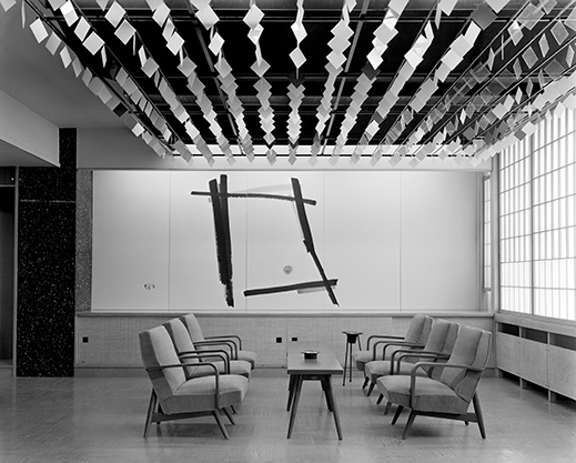
Mural for Yamanashi Prefecture Civic Hall, 1957 (Architectural design: Tachu Naitoh, Nobumichi Akashi). Photo © Osamu Murai |
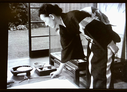
In addition to a selection of Shinoda's lithographs, which echo her paintings in color and form, the exhibition also displays an assortment of items including books and record covers graced by her calligraphy. One especially intriguing part of the show is its focus on Shinoda's collaborations with architects, explored in a six-minute slideshow of photographs. In the 1950s and 1960s Shinoda created paintings, murals, reliefs, theater curtains, and other works for spaces around Japan and the world designed by such noted architects as Isamu Kenmochi and Kenzo Tange. These pieces were not meant to be merely decorative, but rather integral parts of the buildings. Finally, there is a 16-minute film from 1957 by the Belgian artist Pierre Alechinsky paying tribute to Japan's culture of calligraphy and typography. While very much a mid-century artifact with strong Empire of Signs vibes, the movie does show a kimono-clad Shinoda at work with her inkstone and brushes.
 |
|
Toko Shinoda filmed in Pierre Alechinsky's Calligraphie Japonaise (1957). |
The upstairs Terada Collection exhibition, included in the price of admission to the gallery, presents abstract art from the 1960s to the 1980s. With vivid, energetic paintings by Kazuo Shiraga, Keiji Usami, Lee Ufan, and many others, it complements the Shinoda retrospective as its own feast for the eyes.
Tokyo Opera City Art Gallery regulars might be surprised to see that its shop has undergone a change in name and management. Now run by the Ebisu art bookstore limArt and called Gallery 5, it features a more streamlined selection of titles centered on the current exhibition. The shop's graphics are by Nerhol member Yoshihisa Tanaka and its interior design is by Schemata Architects.
All works shown are by Toko Shinoda; all photos by Jennifer Pastore, courtesy of Tokyo Opera City Art Gallery. Translations of Shinoda's words are by the author except where otherwise indicated. |
|
 |
Jennifer Pastore
Jennifer Pastore is a Tokyo-based art fan and translator. In addition to Artscape Japan, her words have appeared in ArtAsia Pacific, Sotheby's, and other publications. She is an editor at Tokyo Art Beat. |
|
|
|