|
|
Oct. 1, 1996
|
Art Watch Index - Sep. 24, 1996
![]()
<<IZUMIWAKU Project 1996>>
Takashi MURAKAMI
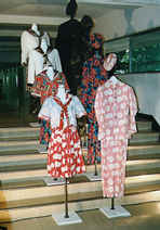
ID BOUTIQUE
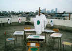
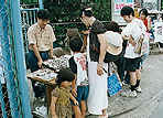
IZUMIWAKU AOZORA Flea Market
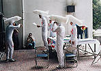
Performance of Yoshiaki KAIHATU
(Upper-Right: trademark of IZUMIWAKU, Illustrated by Takashi MURAKAMI)
IZUMIWAKU Project 1996 - Makoto MURATA Art Information, Aug.6
|
Where Is the <<IZUMIWAKU>> Going?
The <<IZUMIWAKU Project 1996>> is a contemporary art exhibition which was held at the Suginami Ward Izumi Junior High School during the summer holidays. In the first exhibition of this series, it became a sensation due to the fact that it changed a school into a "museum". Ever since, similar attempts have also been made in elementary schools and kindergartens in various areas. Because of this, the expectation towards the second exhibition became even greater, and the evaluation of it, more critical. Participating artists ranged from Taro Okamoto to young, anonymous artists, amounting to 30 members, which included those from Korea and Europe. There were many works which were produced under the theme of the school, such as the "ID BOUTIQUE" consisting of school uniforms made from flower-patterned fabric, Toichiro Oshikawa's work in which he pasted up officious slogans in the school grounds, and Theophile Billich's work where a tape announcing the deviation values were broadcast together with a photograph of the students falling flat on their faces on the desks. However, this time, efforts were exerted more on the workshops and symposiums than on the exhibition. This fact may be a reflection of the change of the subtitle from the "School Museum Plan" to "School Art Center Plan". In other words, the intention was not only to make the school a place to exhibit artworks, but also to emphasize communication between the artists and the visitors (especially children) and to narrow the distance between art and society using the school as the pivotal point. This idea itself has certainly developed one step further. However, although I cannot tell how much had been achieved since I was not able to participate in all the programs, is it my subjective impression that I felt there were fewer volunteers from the parents compared to the previous exhibition? The <<IZUMIWAKU Project 1996>> must probably be understood not as one exhibition, but as one movement. If so, it is necessary to clarify who is taking on its responsibility, and in which direction this movement is aiming for. If all the staff, including the artists, are volunteers, naturally, the direction and limitations of the activity should be apparent. The best exhibition in this project was the <<Apaato Taro>> exhibition held at the Synapse Gallery near the Izumi Junior High School. The Synapse Gallery is a "one-room gallery" using a 6-tatami-mat-room in an old apartment, but there, the model (145cm in height) of the "Tower of the Sun" by Taro Okamoto was enshrined! My, oh my...if Taro Okamoto had seen this, he would have said "What in the world is this!", and rolled his eyes in contentment. [Makoto MURATA/Art Journalist]
|
|
|
|
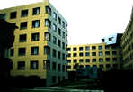
Photo: Yasuhiro KUNO
Steven Holl http://www.walrus.com/~sha/
Huis Ten Bosch
|
The Strategy of Architecture Concerning
the "Sugar-coatedness" of Apartments
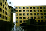
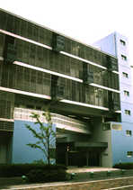
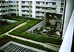
The request from the developer and the architect's design The Makuhari Bay Town, a residential area in the Makuhari New City Center, is a new urban development plan taken on by both the public and private sector, where several private developers formed a group under the call of the Corporation Agency of the Chiba Prefecture. Patios 11th Avenue designed by Steven Holl, an architect from New York, was included in the second phase. This building has been received very well. However, I cannot help but take a distorted attitude. That is because I was involved as the person in charge for Kazunari Sakamoto, who designed Patios 4th Avenue together with Yasumitsu Matsunaga, and I learned various things, be it good or bad, from the planning of this area. This town has a design code in order to give the total scenery of the town, a consistency. The building must be U-shaped with the courtyard facing the street, the facade must have a 3-layer structure, the building must have a roof, a facade facing one street must be designed by multiple architects, and windows (such as those of a living room) must be facing the street side. These are apparently set with Berlin as the model, but considering that this is a reproduction of a traditional European scenery in the reclaimed land of Makuhari, it is no less different than a theme park such as the Huis Ten Bosch. Since the Matsunaga/Sakamoto team did not consider "living in a theme park" to be very comfortable, they tried to maximize the flexibility in the design code, suggesting a design in which, for example, the majority of the facade was covered with louvers. As a result, this was argued many times by the creator and the protector of the design code, the <Design Adjustment Committee>, but this helped clarify one thing. That is, the criteria for being in line with the design code are not the specific construction of the streets or the elevation, but they are in the atmosphere which is created through them. Would this be called the "sugar-coatedness"? It is the "market inside story" unique to the housing industry, which overlaps with the image of richness continuously reproduced by media such as magazines and television, and the image of a happy family. Unless an apartment is "sugar-coated", it becomes difficult to distribute it as real estate or an object of speculation, thus all apartments must be "sugar-coated". This "sugar-coatedness" was originally something used to explain the request from the developers, so we could say that the urban planning project simply incorporated it. However, together with the stable selling power of this "sugar-coated" establishments, developers also request for an "extraordinary", novel housing for about 10% of the total volume, in order to pioneer new needs. Honestly speaking, I had been feeling opposition against such an ideology where the architect's design was frameworked as a partly allowed freedom within this "sugar-coatedness". Architecture which depicts the standpoint of the architect In the world of architecture in Japan, until today, whether to accept this "sugar-coatedness" or to oppose it, was an effective standard to evaluate the position of the architect as an artist (for example, the term, "commercial architect", still contains a contemptible nuance). The reason why the area designed by Matsunaga and Sakamoto stands out among the simultaneously built areas in phase one, is because we can decipher the opposition around this "sugar-coatedness" between the two. Then, how about the area designed by Steven Holl? First, he divided the whole area into the "conformist=the houses of stillness" section which holds the majority, and the "activist=the houses of movement" section which comprises the minority. In the area of the "stillness", although the houses deviate from the 3-layer structure and having roofs, the outer walls that have a texture of painted walls, their color, and the flower holders, give the buildings enough "sugar-coated" atmosphere. Among the gaps between the several buildings, small metallic "houses of movement" are inserted, constructing the gate towards the courtyard. By designing the exterior of the majority ="stillness" and the houses of "movement" (the interior of the "still" houses are not shown in magazines), he structuralized the problem of "sugar-coatedness" concerning apartments, and the positioning of the architect within that problem. Here, the attitude towards the "sugar-coatedness" is suspended, and only the social environment in which the Makuhari apartments are established, is defined. The fact that the reality where the architect's freedom is limited, is reflected in the houses comprising the minority ("activist"), indicating it as part of the composition of the architecture, seems to depict from afar one's own environment, which could be opposite his specific emotion, and also gives us an impression of a humorous mind. [Yoshiharu TSUKAMOTO/Architect]
|
|
|
|
|
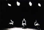
26th Seriés - Le Fruit de Hasard
Photo: Mika 'Taro' SHIRAIWA
|
The Meaning of "Idleness"
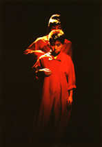
Intended idleness for a resilient dance Although it is true that a "resilient" dance is better than a "rigid" one, apart from this, there is another rare "quality" found in dance. It is not certain whether the "quality" is equal to or surpasses that of "resilience". "It" is very hard to describe, but is often seen in people like Groucho Marx, John Travolta dancing the twist in the movie "Pulp Fiction", or Mika Kurosawa & Dancers. "It" is presented in total relaxation, and therefore at "first glance" "it" looks like something "random", "careless" or "sloppy". However, at "second glance", one finds that there is something astonishing occurring to "it" (also in the body of the dancer, in his/her performance, in the surrounding space and in myself). What is happening is not performing a "dance" as "choreography" (That would make the dance "rigid", because a "person doing a choreography" is bound to become rigid.), nor is it not doing anything i.e. "simply being", nor is it the middle ground which is to come close to "dance" as much as possible (the level of being "resilient"). "It" is a state in which "it" itself becomes "dance". In other words, "it" is, the dancer = dance, the performance = dance, the space (between the dancer and myself) = dance, the time (of the dancer and myself) = dance. In order to become "resilient", one must be "innocent", and in order to become "it", one must be "idle". The question is, can one be completely "idle" intentionally (through the help of a system or by training?). In search for the "idleness" I arrived at the theater 15 minutes before the opening. The house lights were on. I found the dancers in training wear with a towel on their neck, sitting in a square on the stage. One dancer was standing at the center of the stage and moving his body. Others were stretching or wiping their perspiration by inserting their towel under their shirt. Soon, the lights were off and the door was closed, supposedly indicating the start of the "performance". However, there was "no apparent change before and after the start of the performance", either on the stage or on the dancers. In the performance, the dancers took turns to dance a solo performance. When it was time for a dancer's performance, each one danced one piece using their own tape recorder and tape. This reminds one of a karaoke party for high school students. Of course the degree of "idleness" is different between singing karaoke in their room or in a big "contest", but today, judging from the "brushing on the train" or from "kissing on the street", it is apparent that children are not self-conscious anymore when singing in public. Similar to that, in this "dance performance", there were some successful numbers, in which a type of dance that is done inside one's room as a result of naturally swaying his hips to the music, became a public performance. It is not clear whether that was a fruit of "chance". Among the performers of that day, I was a little concerned that I felt something more "dance-like" among the "amateurs" rather than the professional dancers other than Kurosawa. In any case, the pursuit for "idleness " is not a waste of time, but something indispensable. That is, if you (and I) still consider dance as a necessity.
[Keisuke SAKURAI/Musician]
|
|
|
|
|
|
|
|
|
Oct. 1, 1996
|
[home]/[Art Information]/[Column]
Copyright (c) Dai Nippon Printing Co., Ltd. 1996
Network Museum & Magazine Project / nmp@nt.cio.dnp.co.jp
