 |
|
 |
| Through a special printing process, Sugiura's design for the Musashino exhibition catalog reveals, when viewed with a magnifying glass, shifting levels of depth. "When I open a book," he says, "I feel as if I am looking into a deep well. I find not only a source of life energy, but also the memories of the earth imprinted there. The book is a medium connecting us to the fathomless unsolved secrets in words and sound." |
|
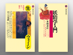
Two titles from the long-running Gendai Shinsho imprint designed for Kodansha over 35 years from 1970. To attract the interest of casual bookshop browsers, each cover of what would eventually tally some 1,700 works featured a full-color print and a concise explanation of the contents, yet the layout was altered every time -- a groundbreaking approach for a paperback series. |
The graphic designer Kohei Sugiura estimates that designs for some 5,000 books have crossed his desk over the 50-plus years of his career. Still more impressive is that this prodigious output has been rendered with a craftsman's care for form, meaning, pleasure, and longevity. A master of the printing arts, Sugiura has always known what many of us, muddled by today's publishing shakedown between print and digital, are just now realizing with a sigh of relief: there will always be a need for printed books made with rigor by authors, editors, designers, and publishers who embrace the object's very physicality -- its sensuality -- as its best asset.
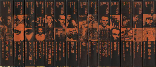 |
A 15-volume series of the complete works of Louis-Ferdinand Celine demonstrates Sugiura's dynamic use of the spine to showcase the content within. Where two volumes carry one long novel, related photos extend across the spines, linking them. Orange characters on black evoke the author's explosive, violent literary style.
(Kokusho Kankokai, 1978-2003) |
A "Pan-Asian Grammar of Design"
A pioneer in the use of distinctly Asian motifs, Sugiura draws inspiration from the region's diverse mythology, religions, and cultures, particularly ancient teachings on the origins and manifestations of Cosmic Dynamism found in India's Upanishads and in the writings of China's Lao Tzu and Chuang Tzu. He says he awakened to his innately Asian aesthetic sensibility while teaching at the Ulm School of Design in West Germany in the 1960s. A trip to India in 1972 further opened him to the "whirlpool of senses that is Asia," and he began to think of the region's iconography and non-Latin alphabets -- for example the multilayered pictographs used in China, Taiwan, and Japan -- as key to an entirely different approach to visual communication. Today, his integrative style is a beacon for designers and scholars throughout the region who seek ways to preserve their homeland's cultural and text traditions in the era of information technology. As director of the Research Institute of Asian Design, launched last April by Kobe Design University, Sugiura continues to address new issues in typography and editorial design, notably ways in which the printed and digital word can coexist in East Asia. He sees the future of information graphics in the region as "a kind of richly textured brocade, woven of many elements."
One purposeful stride toward what Sugiura calls a "pan-Asian grammar of design" has been made at Tokyo's Musashino Art University, where a three-year project to curate a complete archive of his design output over the past five decades has nearly concluded. To celebrate the acquisition, a thoroughgoing retrospective of his methods and philosophy of book design is now underway at the university's museum.
The venue is symbolic: the 1960s modernist edifice, designed by Yoshinobu Ashiwara and one of the original campus buildings, reopened in June after renovations to update its structure and link it to the adjacent library constructed last year. Just as the treasured building has been given new life, so too have Sugiura's contributions to the field of information design found a new platform for discovery by the next generation. Musashino, now with a complete collection of his oeuvre, seems poised to become an Asian center for research in visual communications design.
 |
|
 |
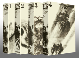
The four volumes of Tao by the spiritual leader Bhagwan Shree Rajneesh discuss Lao Tzu's philosophy from an Indian point of view. When lined up together, the images of the author's face on the spine appear to move, as if he were about to speak.
(Merkmal, 1979-1982) |
|
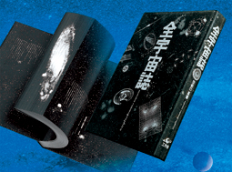
Edited by Seigow Matsuoka, Summa Cosmographica is a stunning compendium of heavenly bodies, starlight, and stardust -- all white ink on black -- inspired by space-based radio meteorology in the 1970s. The trim edge reveals, when viewed from the front, the Andromeda Galaxy, and from the back, a chart of the constellations.
(Kousakusha, 1979) |
Not One, but Two Exhibitions
Held in private storage since their publication, all of the 1,000-plus works on display are in mint condition, as crisp and bright as they were on their day of release. Moving through the islands of anthologies, fine art publications, paperbacks, deluxe editions, reference books, and even album, laser-disc, and CD jackets in the vast gallery is akin to time-capsule travel through five decades of publishing in Japan from the 1960s onward -- a historical overview of printing techniques, new materials, and design trends, many of which Sugiura spearheaded. At the first display near the entrance, a volume -- now out of print -- entitled Light, Motion, Space: Art at the Periphery seems to speak for the whole of the exhibition itself: one moves through the gallery from monotone areas to sudden splashes of color as satiny swathes of transparent fabric sway in the air currents above and the walls flicker with moving images, also of Sugiura's design.
At a reception held on the opening day of the exhibition, Sugiura spoke fondly of the hours he spent on the production floor of Japan's printing houses, learning hands-on from the operators, absorbing their skills, and understanding the limitations -- and thereby the latent possibilities -- of the process. That his body of work continues to inspire practitioners of the visual communication and information arts today is testimony to the visionary ways in which he pushed the technology envelope, and to the intellectual rigor behind his graphic designs, which were, more often than not, conceived as antitheses to prevailing trends.
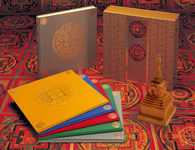
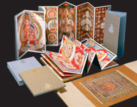
Among the exhibits is a trio of limited-edition, ultra-deluxe books representing both the height of Sugiura's craft and a motif dear to his heart -- the mandala. These same three works, Tibetan Mandalas -- The Ngor Collection (1972), Den Shingon-in Ryokai Mandala: The Mandalas of the Two Worlds at the Kyoo Gokokuji in Kyoto (1977), and Venus <Urania-Pandemos> (1982), will be the focus of a separate exhibition from December 1 at ginza graphic gallery (ggg), where video and panel displays will explore a truly Sugiura-esque insight: he posits that Botticelli's Birth of Venus and Allegory of Spring reveal, when viewed together, graphic elements and a composition that resonate with the mandalas of Tibetan and Chinese origin.
 |
|
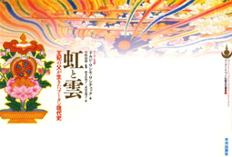 |
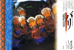
| Bali Entranced (Obunsha, 1987) is one of a number of books for which Sugiura toured Asian countries with photographer Hiroshi Suga. At right is Sugiura's cover design for Of Rainbows and Clouds (Hirakawa Shuppan, 2004), the memoirs of Yab Ugyen Dorji as written by his daughter, Her Majesty The Queen of Bhutan. |
The Part Contains the Whole
Essential to Sugiura's unique perspective are the tenets "one in two, two in one" and "one in many, many in one" -- philosophies that he believes the book, as an object, embodies perfectly. "A single sheet of white paper is like a universe -- it reflects the flow of time and space," he explains. "A book is a bundle of them, with pages that turn freely, although they are bound at the spine. When opened it reveals a pair of pages, left and right. It also has a top and bottom, representing heaven and earth. Duality is inherent to its structure, yet its pages are multiple layers. There is multiplicity, too, in a book's gathering together of many characters, images, chapters, and subjects. When the book is closed, it becomes one again, like two hands pressed together in prayer -- the ultimate symbol of unity."
As a craftsman, Sugiura, who majored in architecture at Tokyo University of the Arts, approaches book design in the same way an architect sculpts space. Though his building blocks are typography, ink, paper, and printing methods, his works are kinetic, multi-dimensional, and all of a piece: individual parts relate, each in its own intrinsic way, to a central, defining theme. In the same way that an architect is concerned with our sensory experience of space, Sugiura considers the sensuous interaction between the reader's imagination and the author's voice. Thus, a thematic painting may extend from a memoir's front to its inside cover, ripple across the book's trim edge to its back inside cover, and out again to the back in one fluid motion; or the spines of a multi-volume series may enliven the owner's bookshelf as if it were a gallery. "How the content is flowed -- its sequence, if you will -- gives shape to the inherent meaning and quality of the text," he says. His designs invite us to taste the word-sounds on the tongue and to hear the phrases somewhere beyond the eye and the mind. They are, indeed, a prayer.
 |
|
 |
|
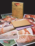 |
The book as temple: the apex of book craft, this trio of ultra-deluxe works displayed at both the Musashino and Ginza exhibitions celebrates the printed page as a timeless repository of thoughts and ideas. The Ginza show focuses on Sugiura's seminal observation linking paintings of the Italian Renaissance with the Buddhist concept of the mandala as an archetype of wholeness.
(Kodansha, 1972; Heibonsha, 1977; Miura Printing, 1982) |
On November 14, Musashino professors Tadanori Nagasawa (Design Informatics), Yusaku Terayama (Visual Communication Design), and Kenya Hara (Science of Design) will join Sugiura in a symposium on book design. Please check the museum website for details.
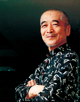 |
Seventy-nine years young, Kohei Sugiura continues to write and lecture on the nexus of form and language, and the need for a design vocabulary founded upon the rich cultural legacy of Asia.
All photos courtesy of Musashino Art University Museum & Library
|
|